Dear reader, to appreciate this post you must understand that this is my father’s business. This project is the culmination of years of conversations with my father about the latest research and technological advances shaping the field of marketing. All advances were discussed in the context of his business, but never applied. This came to an end in September 2024, when we decided it was time to put ink to our ideas and bring them to life.
Linea Exhibitions is one of the oldest players in the Greek commercial exhibition market. Founded in the 1980s as an exhibition hosting company, it has operated for the past 15 years as a stand design and construction firm. The usual suspects were under questioning—brand assets, social media presence, multi-channel selling, and the website—all common challenges for boomer-owned B2B businesses.
Even though I have enough material to write a dissertation on this, I’ll be condensing it to the most important learnings — both for myself and for Linea.
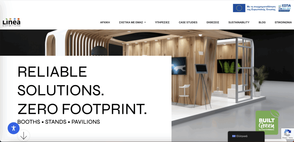
The branding and the website served their purpose by communicating their experience; however, both felt rather characterless & outdated. Sections like our services were either unclear and difficult to comprehend, or required 15 minutes and multiple scrolls to read cover all the information. Of course, the website was built exclusively on stock images.
The renovation began with an update of the brand assets. The logo was redesigned, the colour palette modernized, and the business cards refreshed. Because the brand carried significant heritage and recognition, we focused on incrementally improving the existing logo rather than replacing it. The new design now includes a leaf, symbolizing the company’s commitment to net-zero production — a message reinforced across all communication channels. Linea is currently the only company in its field taking this step, giving it a competitive advantage that competitors will need years to replicate.
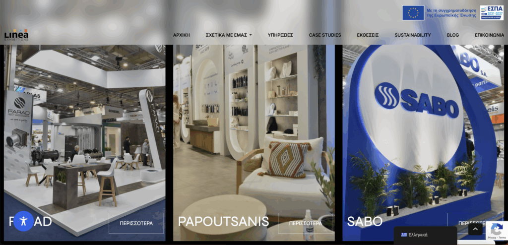
As for the website, within five seconds of viewing the fold, visitors can immediately understand Linea’s USP. The logos of major clients are prominently displayed for anyone who scrolls beyond the first sections, and the site features plenty of project examples for users to explore in detail. Forms are simple, fast to fill in, but also provide a small qualification to the sales team.
Our work also extended to Linkedin, a channel now being used by the majority of our clients but Linea was not part of. After the initial revamping of the profile, Linea has committed to posting its most recent booths, and has also started a newsletter (not for everyone but for those high intent buyers). The work is now being discovered both organically and through promoted posts.
In line with the company’s new image, the sales team also received a full profile upgrade — including refined titles, professional photos, and cohesive banners — and now actively reposts Linea’s work to increase visibility among new connections. Through Sales Navigator, the team has gained access to decision-makers they previously couldn’t reach. Cold outreach on LinkedIn has grown significantly and now accounts for roughly 30% of new business.
Honestly, I wouldn’t consider this a “rebranding” or “redefining” project for the company, but rather a natural step toward digitalization and modernization. Of course, none of this would have been possible without the open-mindedness and willingness to adapt shown by the CEO and all the employees involved.
Finally, I must acknowledge the fantastic external consultant, web design agency, and graphic designer who contributed to the success of this project.